
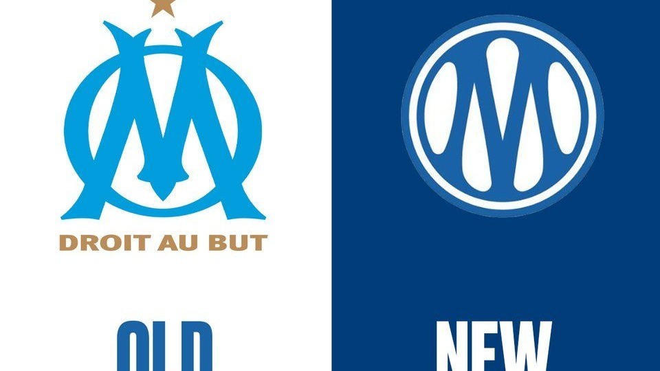
On the evening of April 8, 2026, at the 𝗧𝗿𝗲𝗶𝘇𝗶𝗲𝗺𝗲 𝗛𝗼𝗺𝗺𝗲 𝗚𝗮𝗹𝗮 𝗗𝗶𝗻𝗻𝗲𝗿, a fundraising event for the club’s charitable foundation — 𝗢𝗹𝘆𝗺𝗽𝗶𝗾𝘂𝗲 𝗱𝗲 𝗠𝗮𝗿𝘀𝗲𝗶𝗹𝗹𝗲 unveiled what they called a new identity. Not just a new logo. An identity. And that distinction, subtle as it sounds, is everything.
𝙁𝙞𝙧𝙨𝙩, 𝙩𝙝𝙚 𝙘𝙤𝙣𝙩𝙚𝙭𝙩. 𝘽𝙚𝙘𝙖𝙪𝙨𝙚 𝙘𝙤𝙣𝙩𝙚𝙭𝙩 𝙞𝙨 𝙬𝙝𝙚𝙧𝙚 𝙗𝙧𝙖𝙣𝙙 𝙙𝙚𝙘𝙞𝙨𝙞𝙤𝙣𝙨 𝙖𝙘𝙩𝙪𝙖𝙡𝙡𝙮 𝙡𝙞𝙫𝙚.
𝗢𝗹𝘆𝗺𝗽𝗶𝗾𝘂𝗲 𝗱𝗲 𝗠𝗮𝗿𝘀𝗲𝗶𝗹𝗹𝗲 — 𝗢𝗠, as anyone in France or across the African diaspora knows them is not just a football club. It is the emotional infrastructure of a city. Founded in 𝟭𝟴𝟵𝟵, the club has worn 12 different logos across its history. The one they just retired had been on every kit, every poster, every scarf since 2004. Twenty-two years. That is a long time for a mark to settle into people’s memory.
The decision to redesign wasn’t sudden. Rumblings started as far back as 2024 when L’Équipe reported that a rebrand was coming. Club president Pablo Longoria put it plainly at a press conference in May 2025: “It’s not an easy job, far from it. We must respect the club’s history and its supporters.” Former president Christophe Bouchet — who faced widespread fury from fans in the late nineties after a previous visual change went on record to warn that in Marseille, the crest is considered the very essence of the club. Not a logo. The essence.
So the pressure was real, the stakes were culturally enormous, and what did they do? They brought the work in-house.
𝙏𝙝𝙚 𝙞𝙣-𝙝𝙤𝙪𝙨𝙚 𝙙𝙚𝙘𝙞𝙨𝙞𝙤𝙣. 𝙇𝙚𝙩’𝙨 𝙨𝙞𝙩 𝙬𝙞𝙩𝙝 𝙩𝙝𝙖𝙩 — 𝙖𝙣𝙙 𝙩𝙖𝙠𝙚 𝙖𝙣 𝙖𝙘𝙩𝙪𝙖𝙡 𝙥𝙤𝙨𝙞𝙩𝙞𝙤𝙣 𝙤𝙣 𝙞𝙩.
This is the detail that most coverage skipped past, but for our community it is arguably the most consequential creative and strategic choice of the entire project.
No external agency. The club’s own creative team led the redesign. And the instinct in design circles is often to read that as a limitation, the assumption being that internal teams are too close, too compromised by institutional politics, too unlikely to push hard enough against comfortable choices.
That instinct is worth questioning here, because what OM produced is not the work of a team that played it safe. A full brand system built internally — logo, custom typeface, color palette, pattern language, photography direction, motion guidelines, merchandise application, and a completely rebuilt website — for an institution of this scale, while simultaneously running a football season, is not a modest deliverable. And critically, the creative decisions embedded in that system — the archival research behind the color, the fan photography turned into texture, the deliberate synthesis across four eras of visual history are not the decisions of a team that lacked ambition or perspective.
The more honest reading is this: proximity was the advantage, not the liability. Nobody outside the club could have made the decision to build Marseille Blue from a century of badge research without it feeling like a branding exercise. Coming from inside, it reads as cultural stewardship. The difference between those two things is not just perception — it is the difference between a system that performs identity and one that actually carries it.
That does not mean external creative partnership is redundant. It means the binary — agency versus in-house — is less interesting than the question it obscures: what does the work actually require, and who is genuinely best positioned to do it? OM answered that question for themselves. The answer was internal. And the output justifies it.
𝙇𝙚𝙩’𝙨 𝙡𝙤𝙤𝙠 𝙖𝙩 𝙩𝙝𝙚 𝙖𝙘𝙩𝙪𝙖𝙡 𝙬𝙤𝙧𝙠. 𝙃𝙤𝙣𝙚𝙨𝙩𝙡𝙮.
𝙏𝙝𝙚 𝙡𝙤𝙜𝙤: The new mark keeps the OM monogram — the O encircling the M — but does something structurally different from the 2004 version. In the old crest, the M was a slightly aggressive, serif character that jutted outward, creating tension and energy with the surrounding O. In the new version, the M is fully enclosed, rounder, softer, almost fluid. The club describes it as the M “moving freely — echoing the water, wind, and fire of Marseille.”
What they also did — and this is the part worth pausing on from a brand architecture standpoint — is draw deliberately from four specific eras of the club’s visual history: the white border from the 1973 logo; the structural form of the M from 1899; the curves and dynamic lines of 1986; and the double border framing from 1993. They did not invent from scratch. They synthesized. They treated the archive as raw material.
That is a fundamentally different creative brief than “make us something new.” It is closer to: make us something that is the sum of everything we have been. The intentionality behind that methodology is worth respecting regardless of whether the final mark lands for you personally.
𝙏𝙝𝙚 𝙘𝙤𝙡𝙤𝙧: OM didn’t just pick a blue. They went back and audited every badge in the club’s history, cataloguing each shade of blue across over a century of identity. From that research, they created what they are now calling Marseille Blue — a synthesis of the club’s historic blues and the iconic blues of the city: the blue of street signs, the blue of the calanques, the Mediterranean sky.
This is color as research. Color as archaeology. And the result is a darker, richer navy that is more digitally robust than the sky blue it replaces. It sits alongside Deep Sea, a deeper supporting blue, with white for space and gold for prestige — described as “subtle, confident, and unmistakably OM.”
For those of us who work with color systems professionally, this is worth studying carefully. They didn’t say “we want a stronger blue” and hand it to a color consultant. They built a narrative around color selection that connects to geography, history, and lived culture. That is the kind of color brief that produces meaning rather than preference.
𝙏𝙝𝙚 𝙩𝙮𝙥𝙚𝙛𝙖𝙘𝙚. They built one. Custom. The OM Marseille Font. Geometric strokes, subtle serifs, four weights from Light to Bold. A custom typeface is not a stylistic flourish, it is a commitment. You commission or build proprietary type when you are done borrowing, when you are serious about the system lasting, when you want every piece of communication to carry the same voice even without a logo in the room.
𝙏𝙝𝙚 𝙁𝙚𝙧𝙫𝙤𝙪𝙧 𝙋𝙖𝙩𝙩𝙚𝙧𝙣𝙨. This is the element most design coverage missed entirely, and it is arguably the most emotionally intelligent decision in the whole system. OM took photographs of their supporters — the crowd in the stands, the tifos, the banners, the collective mass of the Vélodrome in full voice — and turned them into abstract organic textures. Three levels of intensity, from subtle to bold, applicable across every communication surface.
Consider what that means as a conceptual position. The fans are not just the audience for this brand. They are literally the material the brand is made from. Their energy, their presence, their ferveur — translated into pattern and woven into every touchpoint. That is a statement about ownership. About who a brand actually belongs to. And it is the kind of decision that only gets made when the people designing the system understand the institution from the inside.
𝘼𝙣𝙙 𝙩𝙝𝙚𝙣 𝙩𝙝𝙚 𝙛𝙖𝙣𝙨 𝙧𝙚𝙖𝙘𝙩𝙚𝙙. 𝙏𝙝𝙞𝙨 𝙞𝙨 𝙬𝙝𝙚𝙧𝙚 𝙞𝙩 𝙜𝙚𝙩𝙨 𝙜𝙚𝙣𝙪𝙞𝙣𝙚𝙡𝙮 𝙞𝙣𝙩𝙚𝙧𝙚𝙨𝙩𝙞𝙣𝙜.
The backlash was immediate and significant. Social media — particularly French football Twitter — was not kind. Supporters called it too corporate. Too soft. Too much like a tech startup and not enough like a football club with 127 years of accumulated passion. A fan-made concept logo — one that retained the sharper, more aggressive serif M from the previous badge — went viral within hours. Many said it was better than the official version.
Let’s look at that reaction clearly rather than either dismissing it or co-signing it.
What fans are responding to when a crest changes is almost never the design itself.
It is the loss of a visual object that has accumulated meaning over years of lived experience — every match, every season, every collective memory anchored to that specific shape. That response is real and it is legitimate. But it is also not a design critique. It is grief wearing the language of aesthetics. The two things are easy to confuse in the first 72 hours, and the design community should be better than that confusion even when the general public isn’t.
The fan concept going viral is a separate and more interesting signal. It suggests that the appetite for a version of the crest that felt more continuous with the old mark was real — that the community had a visual preference the official design didn’t fully satisfy. That is worth noting. It is also worth noting that brand decisions made to satisfy immediate community preference at launch are rarely the decisions that serve a brand well over fifteen years. Longevity and immediate approval are different briefs.
𝙒𝙝𝙖𝙩 𝙩𝙝𝙞𝙨 𝙢𝙚𝙖𝙣𝙨 𝙛𝙤𝙧 𝙩𝙝𝙚 𝙙𝙚𝙨𝙞𝙜𝙣 𝙘𝙤𝙢𝙢𝙪𝙣𝙞𝙩𝙮. 𝙉𝙤 𝙝𝙚𝙙𝙜𝙞𝙣𝙜.
𝗦𝘆𝘀𝘁𝗲𝗺 𝘁𝗵𝗶𝗻𝗸𝗶𝗻𝗴 𝗼𝘃𝗲𝗿 𝘀𝘆𝗺𝗯𝗼𝗹 𝘁𝗵𝗶𝗻𝗸𝗶𝗻𝗴.
The logo will always dominate the conversation because it is the most legible change. But what OM released is a full living system — color, type, pattern, photography direction, motion, spatial branding, merchandise. The logo alone would have been inert without the scaffolding around it. The design community’s tendency to reduce rebrands to crest comparisons is a habit worth breaking. The logo is the entry point, not the work.
𝗧𝗵𝗲 𝗳𝗮𝗻-𝗺𝗮𝗱𝗲 𝗰𝗼𝗻𝗰𝗲𝗽𝘁 𝗴𝗼𝗶𝗻𝗴 𝘃𝗶𝗿𝗮𝗹 𝘀𝗮𝘆𝘀 𝘀𝗼𝗺𝗲𝘁𝗵𝗶𝗻𝗴 𝗮𝗯𝗼𝘂𝘁 𝗽𝗮𝗿𝘁𝗶𝗰𝗶𝗽𝗮𝘁𝗶𝗼𝗻 𝗶𝗻 𝗯𝗿𝗮𝗻𝗱 𝗱𝗲𝘃𝗲𝗹𝗼𝗽𝗺𝗲𝗻𝘁 𝘁𝗵𝗮𝘁 𝘄𝗲 𝘀𝗵𝗼𝘂𝗹𝗱 𝘀𝗶𝘁 𝘄𝗶𝘁𝗵. OM claims to have consulted with the ultras during the process, and the organized supporters apparently approved the direction. But approval and emotional ownership are different things. The viral concept suggests the community had more to say than the consultation process surfaced. Co-creation is genuinely difficult in institutions with deep fan cultures — but the gap between “we consulted supporters” and “supporters feel this belongs to them” is a design and process problem worth naming rather than managing.
𝗧𝗵𝗲 𝗯𝗿𝗮𝗻𝗱𝗶𝗻𝗴 𝗽𝗮𝗴𝗲 𝗶𝘁𝘀𝗲𝗹𝗳 𝗶𝘀 𝗮 𝗱𝗲𝗹𝗶𝘃𝗲𝗿𝗮𝗯𝗹𝗲 𝘄𝗼𝗿𝘁𝗵 𝗲𝘅𝗮𝗺𝗶𝗻𝗶𝗻𝗴. Visit om.fr/en/branding. It is not a press release. It is a brand story presented as an experience — embedded videos showing logo construction, the pattern system in motion, spatial applications at the Vélodrome, merchandise. It functions as a public brand book. Making your creative rationale visible to your audience is a practice more institutions should adopt and more designers should advocate for in their process. Transparency about how decisions were made builds more durable trust than the reveal alone.
𝙏𝙝𝙚 𝙙𝙞𝙖𝙨𝙥𝙤𝙧𝙖 𝙩𝙝𝙧𝙚𝙖𝙙. 𝙏𝙝𝙞𝙨 𝙙𝙚𝙨𝙚𝙧𝙫𝙚𝙨 𝙢𝙤𝙧𝙚 𝙩𝙝𝙖𝙣 𝙖 𝙛𝙤𝙤𝙩𝙣𝙤𝙩𝙚.
OM is a club whose cultural gravity extends well beyond the south of France, and any serious analysis of this rebrand has to reckon with that.
Marseille itself is one of the most North African cities in Europe. The ultras at the Vélodrome — the people whose passion literally became the brand’s texture system — include generations of Algerian, Moroccan, Tunisian, Senegalese, and Cameroonian communities for whom this club is not a leisure preference but a cultural anchor. OM’s partnership with Sublime Côte d’Ivoire, listed on the branding page, is at least a visible signal that the club is beginning to treat its African audience as a commercial and cultural constituency rather than an afterthought.
That matters for how we read the design decisions. The shift to a digitally robust color system, the investment in a custom typeface that works across weights and contexts, the photography direction built for scalability — these are choices that serve a global audience as much as a local one. A brand that only works beautifully on a scarf in the Vélodrome concourse is a different kind of system than one designed to be equally legible on a phone screen in Douala or a billboard in Abidjan.
But let’s push that further. If OM’s fanbase extends across North and sub-Saharan Africa, and if the Fervour Patterns are built from the energy of the crowd, then whose crowd is embedded in those textures? Whose ferveur made it into the system, and whose didn’t? These are not rhetorical questions designed to find fault. They are the design questions that a brand with genuinely global cultural reach has to answer — or at least acknowledge — if the claim to universality is going to hold.
The new identity says it is designed to connect supporters everywhere in the world. That is an ambitious statement. It is also a testable one. Let’s watch how the system lands across the different communities that carry this club, and use what we observe to sharpen how we think about building identity systems for brands whose audiences are genuinely plural.
OM says this identity is “designed to unite supporters around the world.” They say the M moves freely, echoing the water, wind, and fire of Marseille. They say this is not a break with the past.
Whether they succeeded is something only time will fully answer. But the ambition of what they attempted — a full brand system, built internally, rooted in archival research, designed to last fifteen to twenty years — deserves our attention and our genuine critical thinking.
Not just a reaction. Thinking.
That is what DSGN Meetup is for.
What’s your read on this? Think the fan concept was closer to the mark? Think the in-house approach was the right call? Drop it in the comments please.
𝗥𝗲𝗳𝗲𝗿𝗲𝗻𝗰𝗲𝘀
1. Olympique de Marseille — Official Branding Page. om.fr/en/branding (2026). Primary source. Full brand system documentation including logo rationale, color system, typeface, fervour patterns, and brand-in-action applications.
2. SportsLogos.net — “Ligue 1’s Olympique de Marseille Brings Eras Together in New Crest” (April 10, 2026). Covers the April 8 gala dinner reveal, logo construction references to 1899, 1973, 1986 and 1993
badges, and the Marseille Blue color rationale. news.sportslogos.net
3. Footy Headlines — “All-New Olympique Marseille Logo Released” (April 2026). Detailed visual comparison between the 2004 and 2026 crests, fan social media reaction, breakdown of dual-use logo system for sporting vs. institutional contexts. footyheadlines.com
4. Footy Headlines — “New Marseille Logo Concept — Better Than Official?” (April 2026). Coverage of the fan-made concept logo that went viral and the community response it generated. footyheadlines.com
5. Football Business Journal — “Olympique de Marseille Unveils New Logo and Visual Identity” (April 2026). Strategic framing of the rebrand as an evolution across multiple touchpoints including matchday, digital, and global merchandising. footballbusinessjournal.com
6. NSS Sports — “OM Is Set to Register the Club Colours as a Trademark” (July 2025). Background on the deliberate lead-up to the rebrand, Pablo Longoria’s public statements, the involvement of organized supporters in the approval process, and the club’s stated design intent for the next 15 to 20 years. nss-sports.com
7. Graphéine — “New Logo for OM: Analyzing a Sports Crest” (October 2025). Independent design agency analysis of OM’s logo history from 1899, the retro-vs-modern tension in sports identity, and the broader European trend of clubs returning to archival visual codes. grapheine.com
8. Ground News — “Olympique Marseille Changes Its Club Logo After 25 Years” (April 2026). Summary of the official club statement, fan reception across French media, and the 12th logo context within the club’s full visual history. ground.news
9. Kickfootball.net — “Olympique de Marseille Unveils Its New Logo, Now Official” (April 2026). Official club press release language and supporter reception. kickfootball.net